Sunday, 24 April 2016

Bibliography

Books:
  • Stoker, B. 1897, Dracula. The Country Life Press: New York
  • Marsh, M. 2009. Compacts and Cosmetics: Beauty from the Victorian Times to the Present Day. South Yorkshire: Remember When
  • Ledbetter, K. 2009. British Victorian Women Periodicals: Beauty, Civilisation and Poetry. New York, Palgrave Macmillan
  • Yorke, T, 2012. Victorian Gothic House Styles. Newbury, Berkshire: Countryside Books
  • Stamp G & Amery C 1980.Victorian Buildings of London 1837-1887. London, The Architectural Press Ltd
  • Heldreth, L G & Phar M 1999. The Blood Is The Life: Vampires in Literature. Bowling Green OH, Bowling Green State University Popular Press 
  • Miller E, 2000. Dracula: Sense and Nonsense. Dessert Island Books, Westcliff-on-Sea
  • Aldrich M, 1997. Gothic Revival. Phaidon, London
  • Kilgour M, 1995. The Rise Of The Gothic Novel. Routledge, London
  • Mulvey-Roberts M, 1998. The Handbook to Gothic Literature. Macmillan, Basingstoke
  • Ruby J, 1999. Secure the Shadow: Death and Photography in America. MIT,  Cambridge MA 
  • Corson R, 1965. Fashions in Hair: The First Five Thousand Years. Peter Owen, London 
  • Bryer R, 2000. The History of Hair: Fashion and Fantasy Down The Ages. Philip Wilson, London 
  • Sherrow, V. 2006. Encyclopedia of Hair. A Cultural History. Greenwood London 
  • Punter D, 1996. The Literature Of Terror: The Modern Gothic. Wesley Longman, New York 
  • Cavallaro  D, 2002. The Gothic Vision: Three Centuries of Horror, Terror and Fear. Continuum, London
  • Levina M & Bui, 2013. Monster Culture in the 21st Century: a reader. Bloomsbury Academic, New York 
  • Palmer P, 1999. Lesbian Gothic: Trangressive Fictions. Cassell, London 
  • Le Fanu J S, 1964. Best Ghost Stories. Dover, New York 
  • Birchwood J & Jackson C, 2001. Schizophrenia. Psychology Press, Hove 
  • Geekie J & Read J, 2009. Making Sense of Madness: Contesting The Meaning of Schizophrenia. Routledge, Hove 
  • Warner R, 2000. The Environment of Schizophrenia: Brunner-Routledge, London
  • Williams F, 2000. Encyclopedia of Pseudoscience. Fitzroy Dearborn, Chicago, IL
  • King S, 1987. IT. Hodder and Stoughton, London 
  • Aucoin K, 1994. The Art of Makeup. Prion, London
  • Aucoin K, 1997. Making Faces. Little Brown, New York

Films:
  • Tod Browning. Dracula, 1931 [digital video] ITV
  • Terence Fisher. Dracula, 1958 [digital video] BBC4
  • Francis Ford Coppola. Bram Stoker's Dracula, 1992 [digital video] CH4 
  • The Art of Gothic, 2014 [digital video] BBC4 
  • Tod Browning. Freaks, 1932 [digital video] CH4
  • Joseph. P. Stachura. Scream At The Devil, 2015 [digital video] 
  • Stephen King. IT, 1990 [digital video] 


Websites:

Saturday, 23 April 2016

Final Project Evaluation

Gothic horror as a whole was a very challenging project for me in terms of both parts of the project. I loved the theme of both parts of the project as I really enjoy horror themes. I learnt many new techniques that were useful for me to use within the project and will also be useful in the future. The first part of the assessment I think was more successful then the second part which was designing Claudia and Mrs Laderman. I did struggle with the continuity part of the assessment as my character Lucy was not replicated the same and looked quite different from the fist part of the assessment.

I would say this was my weakness for that part of the project, which I will have to improve for the future. What I learnt from the continuity assessments, was firstly making sure that camera and flash settings are the same. Also when using reference images from the first part of the assessment I should have larger images the next time and print them professionally rather than on paper quality. However, surprisingly I really enjoyed designing Lucy and carrying out all the background research to support my designs as well as research in general compared to the last semester as this was one thing that I struggled with. Through research I came across many critical opinions on Dracula and think that this was the successful bit of the continuity part of the project.


The second part of the project, designing Mrs Laderman and Claudia for my chosen Tv series. This part of the project was a real struggle for me as I just did not know where to begin my research and how to develop my characters and fit them into the tv series. Presenting my initial ideas of my characters was a disaster as nothing seemed right. However, the feedback I got from my tutor and fellow peers was helpful and this got me rethinking about my characters and how I would place them into the series. This was the most difficult part of the project for me. I will have to improve on this as I know a similar situation can come up working in the industry, in the future. However, I found this really interesting as well as was really amazed at how professionals actually come up with the characters and it is all based on research.

If I were given a chance to complete the project I would work more on developing my designs with deeper research as I think this is something I lacked with during the second part of this project. Although I looked at the work of professionals like, Chris Nicholls, Alex Box and make up looks worn at famous runway shows, I think I needed to look further for much more inspiration for both parts of the project. Looking at the project as a whole I really enjoyed it and faced many challenges and difficulties, from which I overcome some and learned valuable lessons from some, which taught me a lesson for any similar projects that come up in the future.

Friday, 15 April 2016

Mrs Laderman- The Third Eyed Freak Final Shoot Images

Health & Safety
  • Make sure my partners/models clothing is covered using a gown.
  • Do not double dip spatulas into the make-up palettes. 
  • Always wash hand before application and after.
  • Always carry out a consultation before starting to make sure there are no contra-indications and my partner is not allergic to any products. 
  • Always ask partner/model if they are wearing contact lenses. 
  • Always provide partner/model with after care advice.

List of Products & Tools
  • Cleanser, Toner, Moisturiser
  • Cotton pads, Couch Roll
  • Kryolan Supra Colours
  • Kryolan Aqua Colours
  • Illamasqua Black Eye shadow
  • Translucent Powder
  • Foundation Brush, Blending Brush
  • Detail Brush,
  • Black Kohl Pencil
  • Sharpener
  • Cape
  • Black Wig

Model's Consultation Notes
  • Julia Lange, 20
  • Combination Skin
  • Large Open Pores
  • Hazel Coloured Eyes
  • No Allergies to any Products
  • No Contraindications
  • Dyed Hair, Golden Brown Colour
  • Model wears Contacts


Creating Mrs Laderman as the third eyed freak was a challenge and I was not quite happy with the outcome as I think my creation of the three eyed freak does not look realistic at all and that I could have done better. While creating Mrs Laderman I faced many challenges and one of the biggest challenges was creating the mouth as looking at the final images it does not look realistic at all to me and I am very disappointed with myself. I now feel like if I created the teeth as white and then went in with the shadows and discolouring the teeth this would have been a better option and could have had a better outcome.

I was happy with the outcome on the wrinkles on her forehead and the shading as they look quite dramatic yet have a natural look to them. On the other hand I wasn't quite pleased with how the frowning wrinkles came out as they do not look that natural to me. The overall look of the final outcome was much better than the practice session that I did on myself. I think this is because of adding more shading to all the elements of the design.

Looking at Mrs Laderman's third eye that always watches over Claudia, I also think I could have done a better job with this side of the face as well. The colour of the third eye matched the actual colour of my model's eyes which I was happy about. However, I don't know if its jus me but despite having the same design on all three eyes I don't think the third eye looks like a real eye. I also think that the third eye, second nose and the second mouth on the side of the face look slightly out of proportion.

Looking at the lighting, I was quite pleased with it as I wanted this dark set up for the final shoot of Mrs Laderman. As my my model has golden brown dyed hair I decided to have a black wig for the final look which I think goes better with the dark horror look. Concluding the shoot overall I disappointed with myself as I thought that the application and the outcome could have been better.


Wednesday, 13 April 2016

Claudia Final Shoot Images


Health & Safety
  • Make sure my partners/models clothing is covered using a gown.
  • Do not double dip spatulas into the make-up palettes. 
  • Always wash hand before application and after.
  • Always carry out a consultation before starting to make sure there are no contra-indications and my partner is not allergic to any products. 
  • Always ask partner/model if they are wearing contact lenses. 
  • Always provide partner/model with after care advice.

List of Products & Tools
  • Cleanser, Toner, Moisturiser
  • Cotton pads, Couch Roll
  • Kryolan Foundation Pallette 
  • Kryolan Lip Pallette 
  • Mac Eyeshadow Palette
  • Translucent Powder
  • Foundation Brush, Blending Brush
  • Detail Brush,
  • Black Kohl Pencil, Sharpener
  • Cape
  • Mascara, Disposable Mascara Wands
  • Fake Blood
  • Veil

Model's Consultation Notes
  • Ashwinder Sabharwal, 18
  • Normal to Dry Skin 
  • Small Closed Pores
  • Black Eyes
  • No Allergies to any Products
  • No Contraindications
  • Natural Hair, Not Dyed 

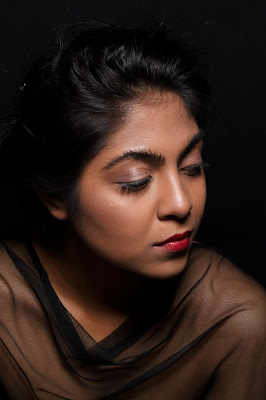
Creating Claudia was a very big challenge as I had to make sure that the make up doesn't look too modern and creating Claudia's hairstyle was a mission as I am not very good with hair. From the research that I carried out on 50's make up, I stuck to the basic elements of the 50 that is the light blush and the classic red lip. I left out the classic winged eyeliner as I thought that this would be a little too modern for Claudia.

Transforming the classic 50's look into a horror look I decided to add in the messy brows and the black kohl pencil at the bottom bottom waterline of  my model's eyes  to add an extra creepy effect. I was quite happy with the final outcome of the messy brows as they worked really well with the final look. As I wanted the make up to describe/scream out at the viewers that even though she is a beautiful young woman, yes there is something creepy, weird and not normal about her. 

This is the reason I added the messy brows and lined the water line of the eyes with black. I then smudged the lipstick on the model and added blood to her fingers. Although Claudia has this divine youthful look, her expression, the messy brows, smudged lipstick and blood on her fingers tell the viewers about her mental disorder and that she is a freak in a way. I wanted to have the veil over Claudia in some images as this describes how she is hidden from the outside world.

Coming to the hair I think I could have done a better job. I tried creating the wave/curve that classic 50's hairstyles have at the front of the hair. I did have the curves in the hair but I think they toned down by the time I went to do the shoot. This might have been because of me not using enough product to set the hair in place. From my inspirations on the lighting I wanted to have dark lighting for the final images of Claudia. I achieved this by playing around with the flash and the aperture of the camera. 


Tuesday, 12 April 2016

Practicing Messy Brows Using Different Mediums- Claudia


I decided to practice the messy brows using different mediums to see what different effects I would get and also to check what will work best for the final shoot. On the picture at the top of the page I used black supra colour and spread this over the brows using a disposable mascara wand. While in the image at the bottom I solely used mascara and applied this over the brow using a disposable mascara wand. To get the messy effect I combed the hairs towards the opposite direction so that they would stand out and look messy.

Using black supra colour was not a good idea as it made the hairs stick to each other more and made the eyebrow look lumpy which can be seen in the image at the top of the page. This also caused the hair not to stand out evenly as most of the were stuck to each other. However, in the image at the bottom it is clearly visible that the mascara did a better job than the supra colour. The hairs were equally distributed and the I felt that the mascara held the hairs in place better than the supra colour did. I will be using mascara instead of supra colour of the brows for Claudia's final shoot.

Monday, 11 April 2016

Claudia-Final Face & Hair Chart & Practice


This is the final makeup and hair design that I will be using to create my character Claudia. I chose this design in specific as I do not want it to look way too modern however I want Claudia's appearance to be divine and beautiful yet screaming out that there is something wrong with her the fact that she is not mentally stable. I would have my model's base as her skin matching foundation. I would go for neutral colours on the eyes mostly beige and browns. I do not have the classic 50's winged eyeliner in this look as I thought it would be too modern.

I would like the brows to be messy as this will sort of describe her mental disorder, telling the viewers that yes she is a freak too, I would create the messy brows using mascara and disposable mascara wants and comb the hairs in the opposite direction as this will create the messy look. I will have just a soft blush on the cheeks and with the red lipstick I will smudge it in one corner of the mouth, I will also be adding blood to her mouth and fingers.

For the hair I will stick with the up do having the wave and structure in the hair that I have in the hair inspirations blog post. I will set the hair with hot rollers to get that volume into the hair. I then will set the hair to one side leaving the curves in the hair that will represent the 50's style.

In the image above is me practicing my design on myself to make sure that it does work as my final design. Looking at the books, the art of makeup and making faces I had the idea what 50's make up should look like. I tried keeping it as simple as I could and avoided the eyeliner in the final look as Claudia is not mentally stable there is no way she would do her winged liner perfect all the time. I didn't want the look to look too modern hence the messy bros that describe her mental disorder that there is something wrong with her. Looking at the brows I think they could have been a little more messy. I will have to check for this when doing the final shoot for Claudia. I will also be adding the smudged lipstick on the day of the shoot as well as the blood.